
Excel Blog
What are the Different Chart Types Available in Microsoft Excel?

Microsoft Excel offers a variety of chart types to help you visualize and analyze your data effectively. Charts are powerful tools that can communicate complex information in a clear and concise manner. In this blog post, we will explore the different chart types available in Microsoft Excel and how you can create them.
Step 1: Accessing Excel
Launch Microsoft Excel on your computer by clicking on the application or opening a new workbook. Ensure that you have the latest version of Excel installed for optimal performance.
Step 2: Selecting Data
Choose the data that you want to represent in a chart. Make sure your data is organized in columns or rows and contains labels or headings.
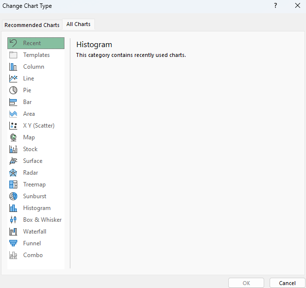
Step 3: Inserting a Chart
Select the data range you want to include in your chart. Click on the “Insert” tab in the ribbon at the top of the Excel window. Choose the chart type that best suits your data from the available options.

Step 4: Customizing the Chart
Once the chart is inserted, you can customize it to enhance its appearance and effectiveness. Right-click on the chart and select “Edit Data” to modify or update the data range. Use the Chart Tools in the ribbon to change the chart style, color scheme, and other formatting options.
Step 5: Exploring Different Chart Types
With Excel, you have various chart types to choose from. Here are some of the most common ones:
- Column Chart: Represents data using vertical bars.
- Line Chart: Displays data as a series of points connected by lines.
- Pie Chart: Shows data as a circular graph, with each category represented by a slice.
- Bar Chart: Similar to a column chart but with horizontal bars.
- Scatter Chart: Plots data points on a graph to show the relationship between two variables.
- Area Chart: Highlights the magnitude of change over time, similar to a line chart.
- Radar Chart: Compares multiple variables on a two-dimensional graph.
- 3D Chart: Provides a three-dimensional view of your data for added depth and perspective.
Step 6: Choosing the Right Chart
Selecting the appropriate chart type depends on the nature of your data and the insights you want to convey. Consider the data’s characteristics, such as its type, size, and relationship, to determine the most suitable chart type.
Use the step-by-step guide above to explore the different chart types available in Microsoft Excel and select the ones that best represent your data and insights. Start visualizing your data today and gain valuable insights from your Excel spreadsheets.
If you’re lacking an Excel license, we have you covered! Visit our website and get one as part of the Office Suite. Choose from Office 2016, Office 2019, or Office 2021 to meet your unique needs.