
Excel Blog
Excel for Scientists: Data Analysis and Visualization

Excel is a versatile and powerful tool that scientists can leverage to effectively analyze and visualize their data. In this informative blog post, we will provide you with a comprehensive step-by-step guide on how to utilize Excel for data analysis and visualization.
Learn how to harness the full potential of Excel as we walk you through the process, starting from importing your data and organizing it in spreadsheets, to applying various analytical techniques and creating impactful visualizations. Whether you’re a beginner or an experienced user, our easy-to-follow instructions will empower you to make the most out of Excel’s features for scientific data analysis and visualization.
Equip yourself with the skills and knowledge needed to manipulate and interpret your data with confidence, uncovering valuable insights and presenting them visually in a clear and compelling manner. Excel’s functionality combined with our guidance will pave the way for effective data-driven decision making and communicating findings in the scientific community.
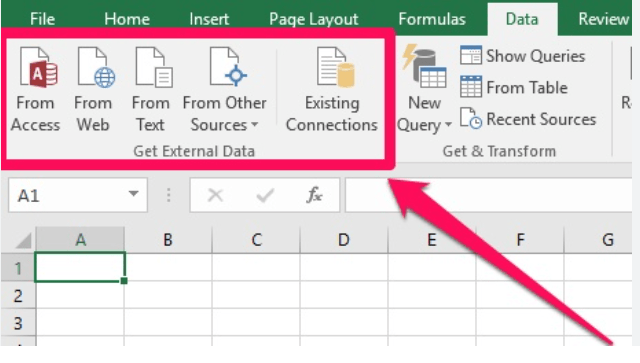
Step 1: Importing Data
To begin, open Excel and follow these steps to import your data:
- Click on the “Data” tab in the Excel ribbon.
- Select “Get Data” and choose the appropriate data source, such as a CSV file or database.
- Follow the prompts to import your data into Excel.
Step 2: Sorting and Filtering Data
Effective data analysis often involves sorting and filtering to identify patterns and trends. To sort and filter your data, follow these instructions:
- Select the data range you want to sort or filter.
- Locate the “Sort” or “Filter” button in the “Data” tab of the ribbon.
- Click on the button and choose the desired sorting or filtering options.
- Excel will rearrange the data based on your selection.
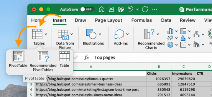
Step 3: Creating Pivot Tables
Pivot tables are invaluable tools for summarizing and analyzing large datasets. Follow these steps to create a pivot table:
- Select the data range you want to analyze.
- Click on the “Insert” tab in the ribbon and locate the “PivotTable” button.
- Choose the data range and the location where you want to place the pivot table.
- Excel will open a new window where you can choose the fields to include and the desired summary calculations.
Step 4: Applying Formulas and Functions
Excel provides a wide range of formulas and functions for data analysis. Follow these instructions to apply formulas and functions:
- Select the cell where you want the result of your calculation to appear.
- Type the equal sign (=) to begin the formula.
- Enter the desired formula or function, such as SUM, AVERAGE, IF statements, etc.
- Press Enter, and Excel will calculate the result based on the provided formula.
Step 5: Creating Charts and Graphs
Visualizing data is crucial for scientists to communicate their findings effectively. Follow these steps to create charts and graphs in Excel:
- Select the data you want to include in the chart.
- Go to the “Insert” tab in the ribbon and select the desired chart type from the options.
- Excel will generate a preview of the chart based on your selection.
- Customize the chart by adding titles, labels, and adjusting formatting options as needed.
By following these step-by-step instructions, scientists can harness the power of Excel for data analysis and visualization. Excel’s wide range of features and functions make it an invaluable tool for scientists working with data. Start exploring and uncover the insights hidden within your data using Excel!
Take charge of your database management prowess with the right Microsoft Office license from our website. Browse through our selection, which includes cheap Office 2016 license , Office 2019 cdkeys, and the cheapest Office 2021 license, and find the perfect fit for your needs.