
Excel Blog
Advanced Chart Techniques in Excel

Charts serve as powerful tools for data analysis and presentation, making it easier for audiences to interpret complex information. In this step-by-step guide, we will explore advanced chart techniques in Excel to create visually stunning and data-driven charts that effectively communicate your findings.
Excel offers a wide range of chart types, including line charts, bar charts, pie charts, scatter plots, and more. In this guide, we will not only cover the basics of creating charts but also delve into advanced techniques that can take your data visualization to the next level.
Step 1: Selecting and arranging data:
- Open Microsoft Excel and select the data you want to include in the chart.
- Use the Ctrl + A shortcut to select all data in a spreadsheet or select a range of cells manually.
- Organize the data in a data table with clearly labeled column and row headings.
Step 2: Chart creation:
- Go to the “Insert” tab and select the desired chart type from the available options.
- Choose a chart that is best suited for the type of data you want to present, such as line, bar, or pie charts.
- After inserting a chart, customize it according to your preferences using the Chart Design and Chart Format tabs.
Step 3: Formatting and labeling:
- Use the “Chart Elements,” “Chart Styles,” and “Chart Filters” options in the Chart Design tab to customize your chart with titles, legends, and data labels.
- Change the color, font, and style of your chart using the various formatting options available.
Step 4: Adding trendlines and error bars:
- To add a trendline, click on the chart, and go to “Chart Elements” > “Trendline” > “More Options.”
- Select the type of trendline you want to add, including linear, logarithmic, or exponential.
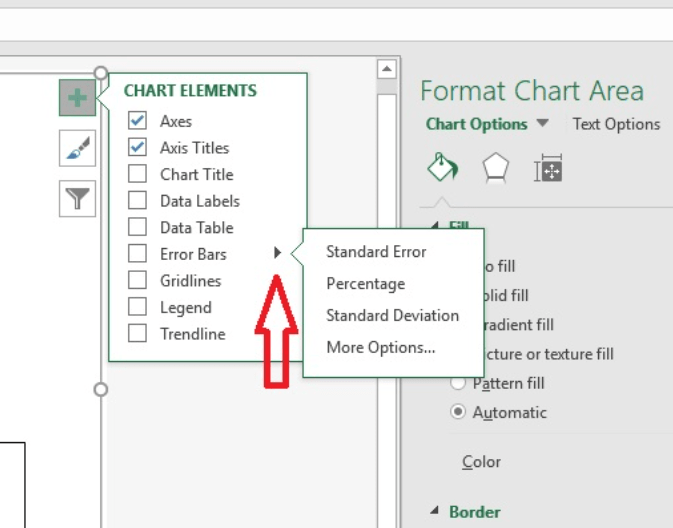
- If you want to add error bars, go to “Chart Elements” > “Error Bars” > “More Options”.
- Choose the type of error bars you want to add, including standard error, standard deviation, and custom values.
Step 5: Creating a combo chart:
- A combo chart allows you to display multiple data series in a single chart.
- Click on the chart and go to the “Chart Elements” > “Combo Chart” tab.
- Choose the secondary chart type and the data series you want to display.
Step 6: Using sparklines and conditional formatting:
- Sparklines are small charts that can be added to tables and cells, making it easier to visualize trends and changes in data.
- Go to “Insert” > “Sparklines” and select the type of sparkline you want to add.
- Use conditional formatting to highlight specific data points or ranges in your chart.
- Go to “Home” > “Conditional Formatting” > “Highlight Cells Rules” > “Greater Than/Less Than” to add conditional formatting.
Conclusion:
Advanced chart techniques are important for effective data analysis and presentation. By following these step-by-step instructions for chart creation, formatting, adding trendlines, creating combo charts, using sparklines, and conditional formatting, you can create visually stunning and data-driven charts that effectively communicate your message. Excel provides a vast range of charting features and customizations that can help you create charts to match your specific needs, and with these commands and techniques, you can master them all. Take your charting skills to the next level with Excel’s advanced chart techniques.
Simplify your database management with the right Microsoft Office license from our website. Our selection includes Office 2016 cheap keys, Office 2019 cd keys, and the cheapest Office 2021 licenses. to suit your needs and budget.