
Excel Blog
Creative Visualizations in Excel with Sparklines

Excel’s Sparklines feature offers a seamless way to create visual representations of data right within a single cell. Whether you want to track trends, compare values, or showcase patterns, Sparklines can be a game-changer. In our step-by-step guide, we’ll show you how to use Sparklines effectively, from selecting the right type of Sparkline (line, column, or win/loss) to customizing its appearance to suit your needs. By mastering Sparklines, you’ll unlock a whole new level of creativity in visualizing data within Excel, making your reports and presentations more engaging and informative. Let’s get started and harness the power of Excel’s Sparklines!
Step 1: Open Microsoft Excel:
- Launch Microsoft Excel on your computer.
- If you don’t have Excel installed, download and install it from the official Microsoft website.
Step 2: Enter Data:
- Create a new spreadsheet or open an existing one.
- Enter the data that you want to visualize in a column or row.
Step 3: Select a Cell for Sparklines:
- Choose an empty cell where you want the Sparkline to appear.
- This could be on the same sheet or a different sheet within the workbook.
Step 4: Insert Sparkline:
- With the desired cell selected, navigate to the “Insert” tab at the top of the Excel window.
- In the “Sparklines” section, click on the type of Sparkline that you want to create (line, column or win/loss).
- A dialog box will appear.
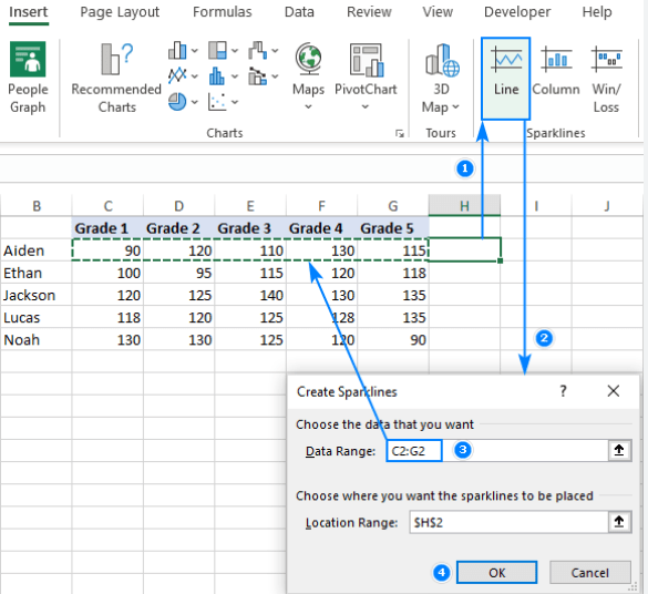
Step 5: Specify Data Range:
- In the Sparkline dialog box, you need to specify the data range for the Sparkline.
- Click on the “Data Range” box and then select the range of cells that contain the data you entered in Step 2.
Step 6: Choose Location Range:
- Next, in the same Sparkline dialog box, click on the “Location Range” box.
- Select the empty cell where you want the Sparkline to be placed (the cell chosen in Step 3).
Step 7: Customize Sparkline Design:
- Excel allows you to customize the design and appearance of your Sparkline.
- With the Sparkline selected, navigate to the “Design” tab that appears when you have a Sparkline selected.
- Use the options to change the style, color, and markers for your Sparkline.
Step 8: Copy Sparklines:
- If you want to apply the same Sparkline design to multiple cells, you can copy and paste them.
- Select the cell with the Sparkline, press Ctrl+C (or right-click and choose “Copy”).
- Then, select the range of cells where you want to apply the Sparklines and press Ctrl+V (or right-click and choose “Paste”).
Step 9: Update Sparkline Data:
- If you make changes to the data range, the Sparkline will not automatically update.
- To update a Sparkline, right-click on it and choose “Edit Data” from the context menu.
- Adjust the data range, and the Sparkline will automatically update.
Conclusion:
Excel’s Sparklines feature provides an effective way to visually represent data within a single cell. By following these step-by-step instructions, you can easily create and customize Sparklines to bring out your creativity and enhance data visualization in Excel. Make your spreadsheets visually appealing and easily understandable with Sparklines.
Take charge of your database management prowess with the right Microsoft Office license from our website. Browse through our selection, which includes Office 2016 Pro Plus keys, Office 2019 Pro Plus keys, and Office Pro Plus 2021 keys, and find the perfect fit for your organization.