
Excel Blog
How can I use the PivotChart Feature in Excel?

The PivotChart feature in Excel allows you to visualize and analyze data from large datasets. In this step-by-step guide, we will show you how to use the PivotChart feature to create dynamic and interactive charts.
Step 1: Open Excel and Prepare your Data
Open Excel and ensure that your data is organized in a tabular format. Each column should have a header, and there should be no empty rows or columns within the dataset.
Step 2: Select the Data
Select the range of data you want to include in your PivotChart. This can be done by clicking and dragging to select a specific range or using Ctrl + Shift + Arrow keys to select the entire dataset.
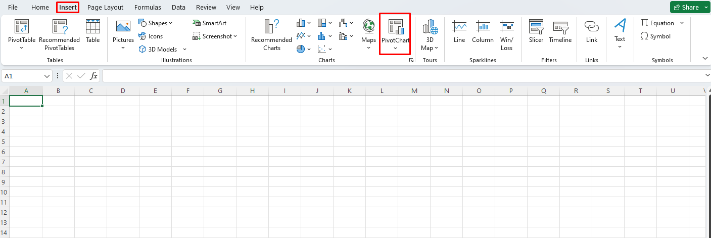
Step 3: Insert a PivotChart
Go to the “Insert” tab in the Excel ribbon and click on the “PivotChart” button. This will open the PivotChart dialog box.
Step 4: Choose the Chart Type
In the PivotChart dialog box, choose the chart type that best suits your data analysis needs. Excel offers various chart types such as column, bar, line, pie, and more.
Step 5: Configure the PivotChart Field List
The PivotChart Field List appears on the right side of the screen. Drag and drop the desired fields from the Field List to the areas labeled “Axis Fields“, “Legend Fields“, and “Values“. This will define the structure and data series of your PivotChart.
Step 6: Customize the PivotChart
You can further customize your PivotChart by modifying the chart elements, adding titles, applying a layout, choosing a color scheme, and adjusting the data series formatting. Excel provides various options under the “Design” and “Format” tabs in the PivotChart Tools section.
Step 7: Refresh and Analyze the Data
If your source data changes or you want to update the PivotChart, simply right-click on the chart and choose “Refresh“. This will update the chart to reflect the latest data. You can also slice and filter the data using the PivotChart by dragging and dropping fields in the Field List.
Step 8: Save your Excel Workbook
Don’t forget to save your Excel workbook to keep all the changes and your PivotChart intact.
By following these step-by-step instructions, you can leverage the PivotChart feature in Excel to create interactive visualizations and gain valuable insights from your data.
Get access to exclusive deals on Microsoft Office with the best price available on our website, enabling you to harness the full power of this productivity suite.