
Excel Blog
Data Visualization in Excel: Charts and Graphs

Unlock the power of data visualization in Excel with our step-by-step guide. Learn how to create charts and graphs to understand and communicate complex information effectively. Master the art of selecting the right chart type, customizing colors and formatting, and adding advanced elements. Enhance your data analysis and presentation skills with captivating visualizations.
Step 1: Selecting Data:
- Open Microsoft Excel and import or enter your data.
- Highlight the cells containing the data you want to visualize.
Step 2: Creating a Chart:
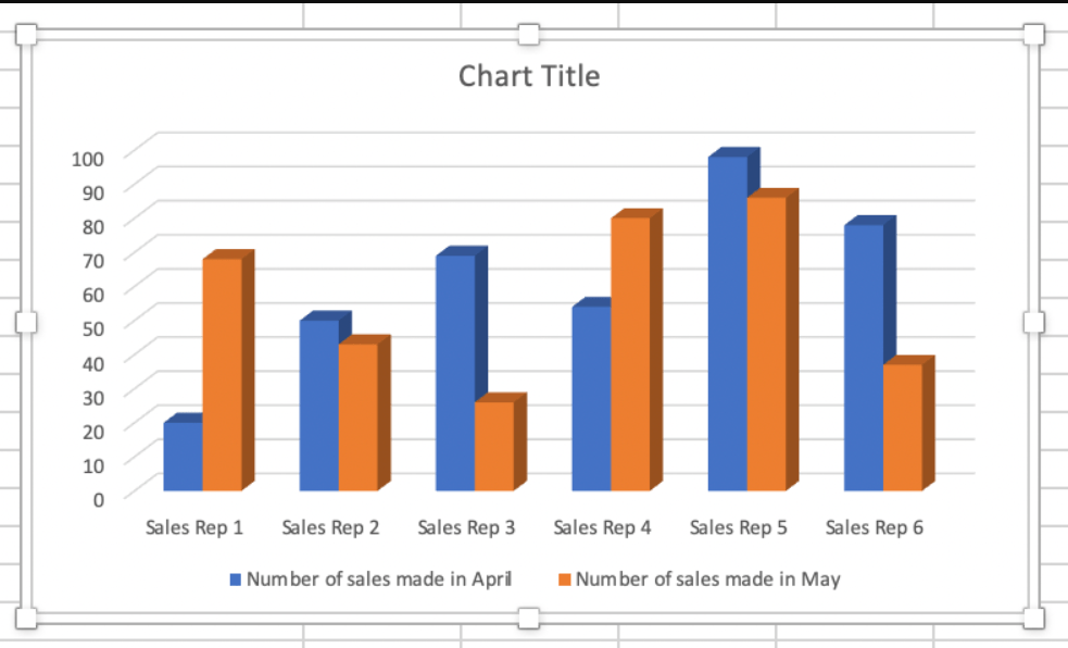
- Navigate to the Insert tab.
- Click on the desired chart type from the Charts group (e.g., column chart, line chart, pie chart).
- Excel will automatically generate a basic chart using the selected data.
Step 3: Customizing the Chart:
- Click on the chart to select it.
- Use the Chart Tools options in the ribbon to customize the chart’s appearance, such as changing colors, fonts, and chart style.
- Modify the chart’s title, axis labels, and data labels to ensure clarity and understanding.
Step 4: Changing Chart Type:
- With the chart selected, go to the Design tab.
- Click on the Change Chart Type button to explore different chart options that better represent your data.
- Experiment with various chart types to find the most effective visualization.
Step 5: Adding Data Labels and Titles:
- Select the chart and go to the Layout tab.
- Click on the Chart Title or Axis Titles button to add titles that explain the purpose and content of the chart.
- Use the Data Labels button to add labels that display specific data values on the chart.
Step 6: Formatting Axes and Gridlines:
- Select the chart and go to the Layout tab.
- Use the Axes options to format the axes, such as adjusting the scale, adding or removing gridlines, and changing the axis labels.
- Experiment with different formatting options to improve the visibility and comprehension of your data.
Step 7: Analyzing Data with Trendlines:
- Select the chart and go to the Layout tab.
- Click on the Trendline button to add a trendline that reveals patterns or trends in your data.
- Customize the trendline by choosing a specific regression type or formatting its appearance.
Step 8: Updating Data in the Chart:
- Modify your original data or add new data points to reflect changes.
- Right-click on the chart and select Refresh or go to the Design tab and click on Refresh Data to update your chart accordingly.
Conclusion:
By following these step-by-step instructions, you can unlock the power of data visualization in Excel using charts and graphs. Select and format your data, create and customize charts, add titles and labels, format axes and gridlines, analyze data with trendlines, and update the chart as needed. Utilize these techniques to create compelling visual representations that effectively communicate your data and insights.
Discover the ideal Microsoft Office license on our website, perfectly suited for your unique database management requirements. With choices like cheap Office 2016 keys, Office 2019 keys, and cheapest Office 2021 keys, finding the perfect fit is a breeze.