
Excel Blog
How do I Create a Line Chart in Excel?

Excel is a powerful tool for data analysis and presentation. Line charts are one of the most commonly used charts to represent trends and variations over time. In this step-by-step guide, we’ll show you how to create a line chart in Excel.
Step 1: Enter Your Data
First, enter the data you want to graph into an Excel worksheet. Make sure to organize your data into rows and columns with clear headings to make it easier to read and understand.
Step 2: Select Your Data
Next, highlight the range of data you want to use for your line chart. You can do this by clicking and dragging your mouse over the desired cells.
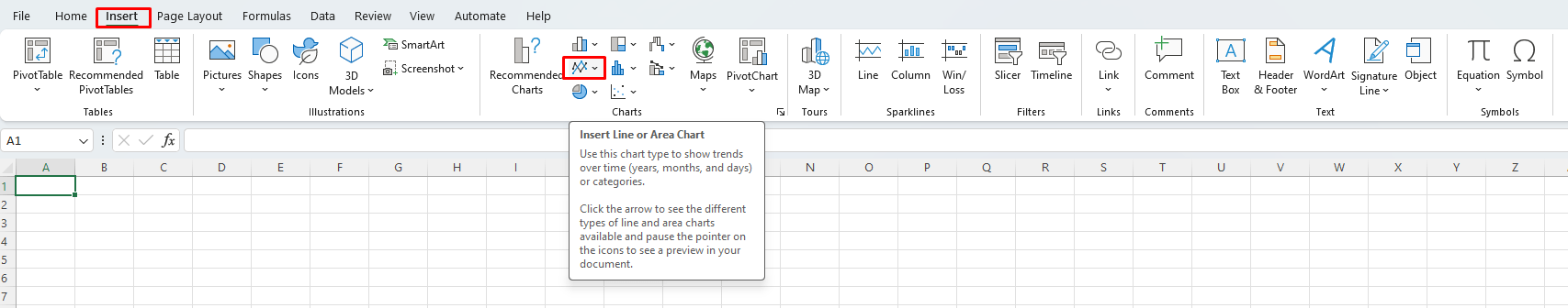
Step 3: Insert a Line Chart
With your data selected, click the Insert tab on the Excel ribbon. From there, click the Line chart icon. Choose the specific type of line chart that you want to create. For instance, you can select a 2D line chart, a 3D line chart, or a stacked line chart.
Step 4: Customize Your Chart
After creating your line chart, you can customize it by modifying the chart elements, such as the title, axis labels, and legend. To make any changes, simply click on the chart element you want to modify, right-click, and choose Format [element]. You can also change colors, fonts, and other chart formatting options.
Step 5: Analyze Your Data
Once you’ve created and customized your line chart in Excel, you can use it to analyze your data and identify trends. Line charts enable you to quickly visualize changes in your data over time and make informed business decisions.
By following these simple steps, you can create professional-looking line charts in Excel to better understand your data and communicate your findings to others.
Looking for an Excel license? We have just what you need! Obtain one from our website, available as part of the Office Suite. Select from Office 2016, Office 2019, or Office 2021, based on your specific needs and desires.