Office Blog
Advanced Data Analysis in Excel: An Introduction to Power Query
In the world of data analysis, Excel continues to be a powerful tool for professionals across various industries. As datasets grow larger and more complex, Excel’s traditional functions can feel limiting, especially when handling repetitive tasks or transforming large amounts of data. Enter Power Query, a game-changing feature for Excel users that simplifies data analysis and enhances the efficiency of workflows. In this post, we’ll explore Power Query’s capabilities, how to make it visually impactful using PowerPoint, and why it’s a must-know tool for anyone serious about data.
What is Power Query?
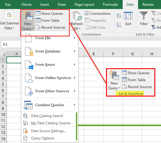
Power Query is a data transformation tool in Excel that allows you to connect to various data sources, clean and manipulate data, and load the transformed data back into Excel. Think of it as a highly specialized assistant that does the heavy lifting for you, automating processes that previously took hours and helping you handle more complex datasets without advanced programming skills.
With Power Query, you can:
- Connect to multiple data sources like databases, cloud services, websites, and files.
- Clean and transform data by removing duplicates, splitting columns, unpivoting tables, and more.
- Automate repetitive tasks, which means you can reuse the same steps for fresh data each time.
- Merge and append data from various sources.
Whether you’re working with customer data, sales figures, or market trends, Power Query simplifies the process, saving you time and effort.

Why Integrate Power Query into PowerPoint Presentations?
Analyzing data is only half the job; the other half is presenting it effectively. For data analysts, marketers, and business leaders, PowerPoint is a standard way to communicate findings. Here’s where you can get creative. Instead of the typical bullet points and text-heavy slides, try presenting your Power Query analysis with visual impact. Here are some tips to design engaging PowerPoint slides that make complex data easy to understand.
Step 1: Define Your Audience and Objectives
Knowing your audience is key to designing effective PowerPoint slides. Are they decision-makers who need key takeaways? Analysts who will delve into the details? Define clear objectives for each slide. Power Query allows you to visualize data in a structured format, but PowerPoint will add that extra layer of clarity and engagement, making your insights shine.
Step 2: Visualize Key Insights with PowerPoint Design Ideas
The PowerPoint Design Ideas feature can help you turn raw data insights into polished visuals. Here’s how you can leverage PowerPoint Design Ideas for your Power Query presentation:
- Summarize Data with Charts: Power Query helps aggregate data into summaries, and PowerPoint Design Ideas can then recommend chart layouts that best suit your data. Try bar charts for categorical comparisons, line charts for trends, or pie charts for distribution.
- Transform Tables into Visuals: Instead of showing a full table of data, focus on the key metrics. PowerPoint can suggest designs that emphasize metrics, with color-coded highlights, icons, or minimalistic layouts to avoid overwhelming your audience.
- Use Consistent Color Schemes and Icons: Power Query-generated data visuals can be imported to PowerPoint, where Design Ideas can align these visuals with your chosen color scheme. Use icons to represent data points and highlight important numbers.
- Add Screenshots or GIFs of Power Query Steps: Sometimes, you’ll need to explain how you transformed data in Power Query. Screenshots or short GIFs can help illustrate key transformation steps or workflows within Power Query, making it easier for viewers to understand the data journey.
Step 3: Use Advanced Visuals to Show Data Relationships
Power Query’s merging and appending capabilities allow you to bring data together from various sources. Using PowerPoint’s SmartArt or custom icons, you can represent these relationships visually, showing the interconnected nature of your data sources. This is especially useful when presenting a holistic view of data from multiple teams or departments.
Step 4: Automate Data Updates with Linked Power Query Tables
One of Power Query’s standout features is that it allows you to create dynamic data queries that update automatically. If your data sources change, you can refresh your Power Query table without redoing all the work. To integrate this into PowerPoint:
- Export Power Query data summaries to a spreadsheet linked to your PowerPoint.
- Each time you refresh Power Query, your PowerPoint-linked spreadsheet will update, ensuring that your presentation data stays current.
Step 5: Highlight Data Quality and Transformation Steps
In many cases, data sources need heavy cleaning before analysis. Use Power Query to document each transformation step, ensuring data quality and traceability. PowerPoint is ideal for presenting this journey. Create a slide sequence that briefly illustrates the cleaning and transformation phases:
- Data Connection: Show the sources, such as an SQL database, online service, or CSV file.
- Data Cleaning: Show before-and-after visuals of cleaned data, perhaps highlighting the removal of duplicates or filling missing values.
- Transformation: Show screenshots or simplified visuals of pivoted data, split columns, or merged tables.
With PowerPoint Design Ideas, you can maintain a clean and professional look, presenting data transformation steps without clutter.
Get genuine Office keys at unbeatable prices—your most affordable solution for accessing essential Microsoft Office tools today!

