Office Blog
Using Excel and PowerPoint Together for Better Data Presentations
In the world of business, education, and almost every other field, presenting data effectively can be the key to making decisions, driving action, and conveying important insights. While Excel is an excellent tool for organizing and analyzing data, PowerPoint is the go-to platform for presenting that data in a clear, engaging, and visually appealing way. By using Excel and PowerPoint together, you can create dynamic, data-driven presentations that resonate with your audience.
In this blog post, we’ll explore how to combine the power of Excel’s data analysis with the visual impact of PowerPoint to deliver compelling, data-driven presentations.
Why Use Excel and PowerPoint Together?
While Excel is a powerful tool for crunching numbers, it’s not always the best for presenting those numbers. That’s where PowerPoint comes in. PowerPoint excels at turning complex data into digestible, visual presentations that can hold your audience’s attention and communicate your message effectively.
Here are the key benefits of using Excel and PowerPoint together:
- Data Accuracy: Excel ensures that your numbers are accurate, while PowerPoint allows you to present them in a way that is easy to understand.
- Visual Appeal: Excel’s raw data can be transformed into charts, tables, and graphs, which can then be incorporated into PowerPoint for a more engaging presentation.
- Efficiency: Instead of manually copying data from Excel into PowerPoint, you can link Excel data to PowerPoint slides for dynamic updates and save time.
Step 1: Preparing Your Data in Excel
Before jumping into PowerPoint, it’s important to ensure that the data you want to present is properly organized and analyzed in Excel.
Clean and Structure Your Data
- Organize Data: Make sure your data is structured clearly, with well-defined headers and columns. Avoid using merged cells, which can cause issues when linking to PowerPoint.
- Use Excel Tables: Convert your data range into a table (by selecting the range and pressing Ctrl + T). This makes it easier to reference the data and ensures that any changes are automatically updated in linked charts or tables.
- Perform Calculations: If you need to calculate totals, averages, percentages, or any other type of analysis, do this in Excel first, ensuring your data is ready for presentation.
Create Charts and Graphs
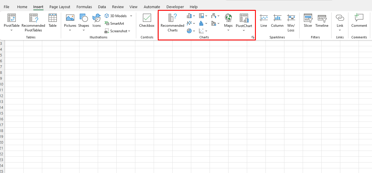
- Choose the Right Chart Type: Excel offers a wide range of chart types (bar, line, pie, etc.). Choose the one that best represents the data you want to highlight.
- Customize Your Chart: Make your charts visually appealing by adjusting colors, adding data labels, and formatting the axes. This step will ensure your charts are clear and easy to understand when transferred to PowerPoint.

Step 2: Importing Excel Data into PowerPoint
Once your data is ready in Excel, it’s time to bring it into PowerPoint. There are several ways to incorporate Excel data into a PowerPoint presentation:
1. Copy and Paste as a Static Image or Table
- Copy the Chart or Table: In Excel, select your chart or table, right-click, and choose “Copy.”
- Paste into PowerPoint: In PowerPoint, go to the slide where you want to place the chart or table, right-click, and select “Paste.” You can paste it as a static image, table, or even a chart, depending on your needs.
While this method is quick, it doesn’t allow for real-time updates. If your Excel data changes, you’ll need to update the chart manually.
2. Link Excel Data to PowerPoint for Dynamic Updates
For a more efficient, dynamic solution, you can link your Excel data to PowerPoint, allowing for automatic updates whenever the Excel file changes.
- Copy the Chart in Excel: Select the chart or table in Excel and press Ctrl + C (or right-click and choose “Copy”).
- Paste Link into PowerPoint: In PowerPoint, navigate to the slide where you want to paste the chart. Right-click and select Paste Special > Paste Link. Choose the Excel object (either the chart or table) and press OK.
With this method, any changes you make to the Excel file will automatically update the linked chart or table in PowerPoint, saving you time and ensuring your presentation stays up to date.
3. Embed Excel Data into PowerPoint
If you want to be able to edit your Excel data directly from within PowerPoint, you can embed an Excel worksheet.
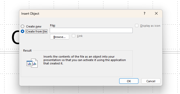
- Embed an Excel File: Go to PowerPoint and select the slide where you want to embed the Excel data. Choose Insert > Object > Create from File. Browse to the Excel file and select it. This will embed the Excel sheet into your PowerPoint slide.
- Edit Data in PowerPoint: Double-click the embedded Excel object to open it and make changes within PowerPoint. This method does not require the Excel file to be open separately but will increase the file size of your PowerPoint presentation.

Step 3: Enhancing Your Presentation with Visuals
Excel charts and tables are only one part of the puzzle. PowerPoint offers a variety of design tools that can help you present data in an even more engaging way.
1. Use SmartArt and Icons
- SmartArt: If you need to illustrate a process, hierarchy, or relationship between data points, SmartArt graphics can help break down complex concepts into simple visuals.
- Icons: PowerPoint has a large library of icons that can be used to add emphasis and visual appeal to your data slides.

2. Add Animations and Transitions
- Animations: Use subtle animations to introduce charts, tables, or key data points. Animations can help guide your audience’s attention and make your data easier to digest.
- Transitions: Smooth transitions between slides help maintain the flow of your presentation and keep the audience engaged.

3. Create Infographics
- Infographics: For a more creative approach, consider creating infographics using PowerPoint’s tools. Combine icons, shapes, and text to visualize your data in a way that’s both informative and visually appealing.
Step 4: Delivering Your Presentation
Now that your Excel data is seamlessly integrated into your PowerPoint slides, it’s time to focus on delivering your presentation effectively.
1. Tell a Story with Your Data
When presenting data, it’s important to tell a compelling story. Don’t just present numbers and charts; explain the insights behind them. Make sure your audience understands the significance of the data and how it relates to the larger message you’re trying to communicate.
2. Keep It Simple
Don’t overwhelm your audience with too much data on one slide. Focus on key takeaways and use multiple slides to break down complex data into digestible pieces.
3. Engage Your Audience
Encourage questions, discussions, and interactions to keep your audience engaged. Use your slides as a guide, but don’t rely on them entirely—make sure to add context and explanation that isn’t in the data.
Get genuine Office keys at unbeatable prices—your most affordable solution for accessing essential Microsoft Office tools today!

