
Office Blog
The Secret to Eye-Catching PowerPoint Slide Layouts

A great PowerPoint presentation isn’t just about content—it’s about design. A well-structured, visually appealing slide layout can make your message clearer, grab attention, and keep your audience engaged. But what’s the secret to creating eye-catching PowerPoint slide layouts? Let’s dive into the best techniques that will instantly elevate your slides.
1. Keep It Simple & Focused
One of the biggest mistakes in PowerPoint design is clutter. Too much text, too many images, or excessive elements overwhelm your audience.
✅ Stick to one key idea per slide
✅ Use bullet points instead of long paragraphs
✅ Leave white space to create balance and avoid overcrowding
A simple, clean layout makes information easier to digest and keeps your slides looking professional.
2. Use the Rule of Thirds for Perfect Alignment
The Rule of Thirds is a classic design principle that helps create balanced and visually appealing slides. Here’s how to use it:
- Divide your slide into a 3×3 grid (PowerPoint’s built-in guides help with this).
- Place your main elements (text, images, or icons) along these grid lines or at their intersections.
- This naturally directs the viewer’s eyes to the most important content.
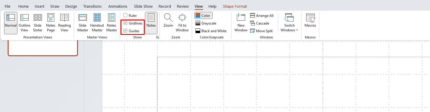
📌 Tip: Enable Guides & Gridlines in PowerPoint (View → Guides / Gridlines) for precise alignment.
3. Choose a Consistent Color Scheme
Color sets the tone of your presentation. A well-chosen color palette enhances readability and visual impact.
🎨 How to pick the right colors?
✔ Stick to 2-3 primary colors
✔ Use contrasting colors for text vs. background (dark text on light background or vice versa)
✔ Use PowerPoint’s Theme Colors for consistency across all slides
Bonus Tip: Try online tools like Coolors or Adobe Color to generate perfect color combinations.
4. Use High-Quality Images & Icons
Low-resolution or irrelevant images can ruin your slide’s design. Instead:
- Use high-quality stock images (Unsplash, Pexels, or PowerPoint’s built-in library)
- Stick to flat or minimalistic icons to maintain a clean look
- Avoid overused, cliché stock photos that look generic
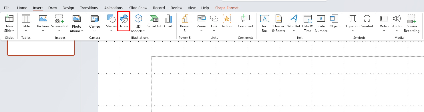
📌 Tip: Go to Insert → Icons in PowerPoint to access thousands of free, built-in icons.
5. Pick the Right Font Combinations
Typography plays a huge role in readability and design. The secret to great font usage? Pairing fonts correctly!
🔠 Font Pairing Tips:
✔ Use a bold font for headings (e.g., Montserrat, Bebas Neue)
✔ Use a readable sans-serif font for body text (e.g., Arial, Lato, Open Sans)
✔ Stick to two fonts max to keep things clean
📌 Avoid: Overly decorative or script fonts—they are hard to read!
6. Utilize PowerPoint’s Built-in Layouts & Design Ideas
PowerPoint has pre-made slide layouts and a Design Ideas feature that suggests professional layouts instantly.
✨ How to use Design Ideas?
- Insert content (text, image, chart, etc.).
- Go to Design → Design Ideas (on the right side).
- Choose from automatically generated layout suggestions.
This is an instant hack to upgrade your slide’s look in seconds!
7. Maintain Visual Hierarchy
A well-structured slide directs the viewer’s attention in the right order. Use:
✔ Bigger text for main points (Headings: 36-44pt, Body text: 24-32pt)
✔ Bold or color highlights for key takeaways
✔ Spacing & alignment to guide the eye naturally
A clear hierarchy ensures that your audience immediately understands your message.
8. Add Subtle Animations & Transitions
Animations add engagement—but less is more!
💡 Best practices:
✔ Use simple effects like Fade or Wipe instead of flashy effects
✔ Apply animations to key elements only (not everything!)
✔ Keep slide transitions smooth and professional (Morph or Fade work best)
Avoid: Overusing animations, which can distract rather than enhance.
Unlock unbeatable savings with the cheapest Office keys available—activate your software instantly and start working smarter today!