Office Blog
How to Create Stunning Charts and Graphs in Excel?
Microsoft Excel is a powerful tool for data visualization, offering a wide range of chart and graph options to help you present your data clearly and effectively. Whether you’re creating a sales report, analyzing trends, or preparing a presentation, Excel’s charting tools allow you to turn raw data into compelling visuals. Here’s a step-by-step guide on how to create stunning charts and graphs in Excel.
1. Why Use Charts and Graphs in Excel?
Charts and graphs make complex data easier to understand by visually representing trends, comparisons, and patterns. Benefits of using Excel’s charting tools include:
- Enhanced Clarity: Visuals simplify large datasets.
- Quick Insights: Easily spot trends and outliers.
- Professional Appeal: Improve presentations and reports with polished visuals.
2. Prepare Your Data
Before creating a chart, ensure your data is clean and organized:
- Structure Your Data: Arrange data in rows and columns with clear headers. For example:
| Month | Sales ($) |
|---|
| January | 5000 |
| February | 6000 |
2. Remove Blank Cells: Ensure there are no gaps in your dataset.
3. Highlight Key Data: Select the range of data you want to visualize, including column headers.
3. Choose the Right Chart Type
Selecting the right chart type depends on the message you want to convey:
- Column Chart: Ideal for comparing values across categories.
- Line Chart: Best for showing trends over time.
- Pie Chart: Use for displaying proportions or percentages.
- Bar Chart: Great for horizontal comparisons.
- Scatter Plot: Perfect for showing relationships between variables.
4. Create a Chart or Graph
Here’s how to create a chart in Excel:
- Highlight your data.
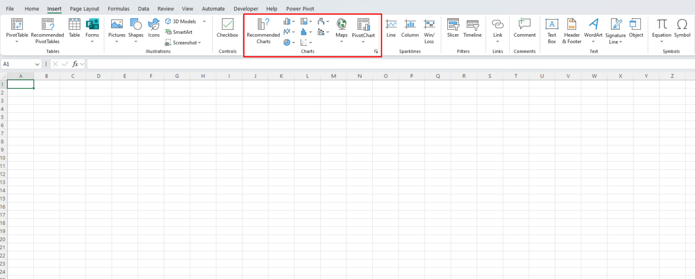
- Go to the Insert tab on the ribbon.
- Choose a chart type from the Charts group (e.g., Column, Line, Pie).
- Excel will instantly generate a chart based on your selection.

5. Customize Your Chart
To make your chart visually appealing and clear, customize it:
Change the Chart Title
- Click on the default chart title.
- Type a descriptive title that reflects your data (e.g., “Monthly Sales Performance”).
Edit Axis Labels
- Double-click the axis labels to rename them or adjust their format.
- Use clear, concise labels that make your data easy to interpret.
Add Data Labels
- Click on the chart.
- Go to the Chart Elements button (plus icon) and check Data Labels.
- This will display values directly on the chart for better clarity.
Adjust Colors and Styles
- Select the chart and go to the Chart Tools tab.
- Under Format or Design, change colors, styles, and fonts to match your theme.
- Use contrasting colors to make your chart elements stand out.
6. Add Additional Elements
To enhance your chart, you can include:
- Legends: Identify different data series.
- Go to Chart Elements and check Legend.
- Place it where it doesn’t clutter your chart (e.g., bottom or side).
- Gridlines: Add or remove gridlines for better readability.
- Trendlines: Show trends or projections by selecting a data series, then adding a trendline under Chart Tools.
7. Save and Export Your Chart
Once you’ve created your stunning chart, you may want to save or share it:
- Copy and Paste: Right-click the chart, choose Copy, and paste it into a Word document, PowerPoint presentation, or email.
- Export as Image: Right-click the chart, select Save as Picture, and choose the format (e.g., PNG or JPEG).
Discover the cheapest office keys available online—affordable, high-quality options to meet all your workplace access needs, only on our website!

