Office Blog
How to Create Dynamic Excel Dashboards?
Dynamic Excel dashboards are a game-changer when it comes to presenting data insights effectively. These dashboards provide interactive visuals, real-time updates, and a clean layout that helps users analyze data effortlessly. If you want to create a professional and interactive dashboard, this guide will walk you through the steps to build one in Excel.
1. What Is a Dynamic Excel Dashboard?
A dynamic dashboard is a visual representation of data that updates automatically as the source data changes. It allows users to interact with the data using tools like slicers, dropdowns, and filters. Dashboards are ideal for tracking KPIs, analyzing trends, or presenting summaries in a visually engaging format.
2. Plan Your Dashboard
Before diving into Excel, take some time to plan:
- Define Your Goals: Identify what insights or metrics you want to display.
- Know Your Audience: Tailor the dashboard design to the needs of its users.
- Gather Your Data: Ensure your data is clean, structured, and ready to be imported into Excel.
3. Prepare Your Data
Clean and organize your data to ensure accuracy and reliability:
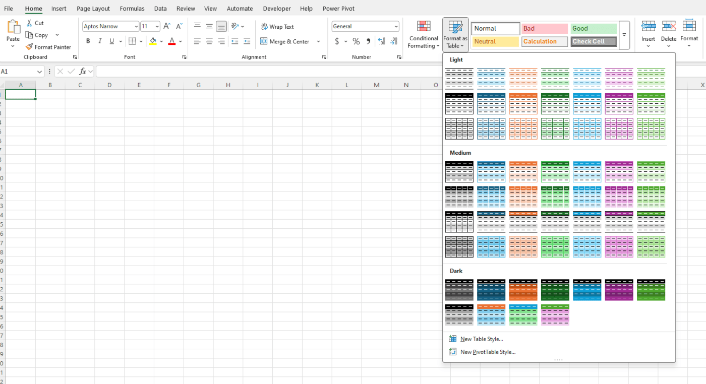
- Structure Data in Tables: Format your data as an Excel Table to allow automatic updates when new data is added.
- Go to Home > Format as Table.
- Remove Errors: Eliminate duplicates, blanks, and inconsistent formats.
- Use Named Ranges: Assign names to data ranges for easier referencing in formulas.
4. Build a Pivot Table for Data Summarization
Pivot Tables are the backbone of most dynamic dashboards. They allow you to aggregate and summarize data quickly:
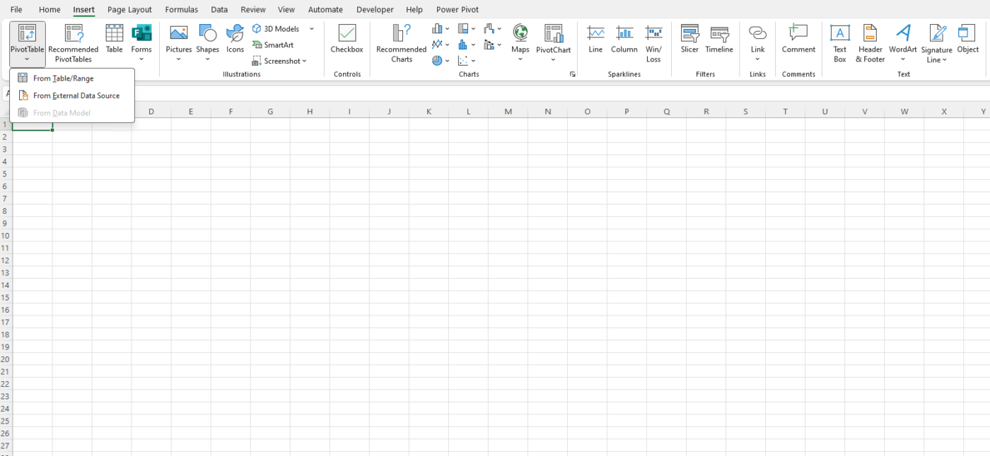
- Select your dataset and go to Insert > Pivot Table.
- Drag fields into the Rows, Columns, Values, and Filters areas.
- Apply filters, group data (e.g., by months or categories), and format the results.
5. Add Interactive Features
Slicers
Slicers make it easy to filter data visually:
- Click on your Pivot Table.
- Go to Insert > Slicer and select fields to filter by.
- Position the slicers on your dashboard and adjust their style.
Dropdown Menus
Dropdown menus provide another layer of interactivity:
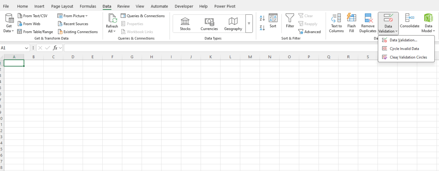
- Select a cell for the dropdown menu.
- Go to Data > Data Validation.
- Choose “List” as the validation type and define your list items.
Dynamic Formulas
Use functions like INDEX, MATCH, and IF to create interactive calculations that change based on user input.
6. Create Dynamic Charts
Visualizations are key to making your dashboard easy to interpret:
- Highlight your Pivot Table or data range.
- Go to Insert and select a chart type (e.g., bar chart, line graph, pie chart).
- Customize chart titles, colors, and labels to match your dashboard theme.
- Link charts to slicers so they update dynamically when filters are applied.
Sparkline Charts
For quick trends, use sparklines:
- Go to Insert > Sparklines.
- Choose a range of data and a location to display the sparkline.
7. Use Conditional Formatting
Highlight important data points with conditional formatting:
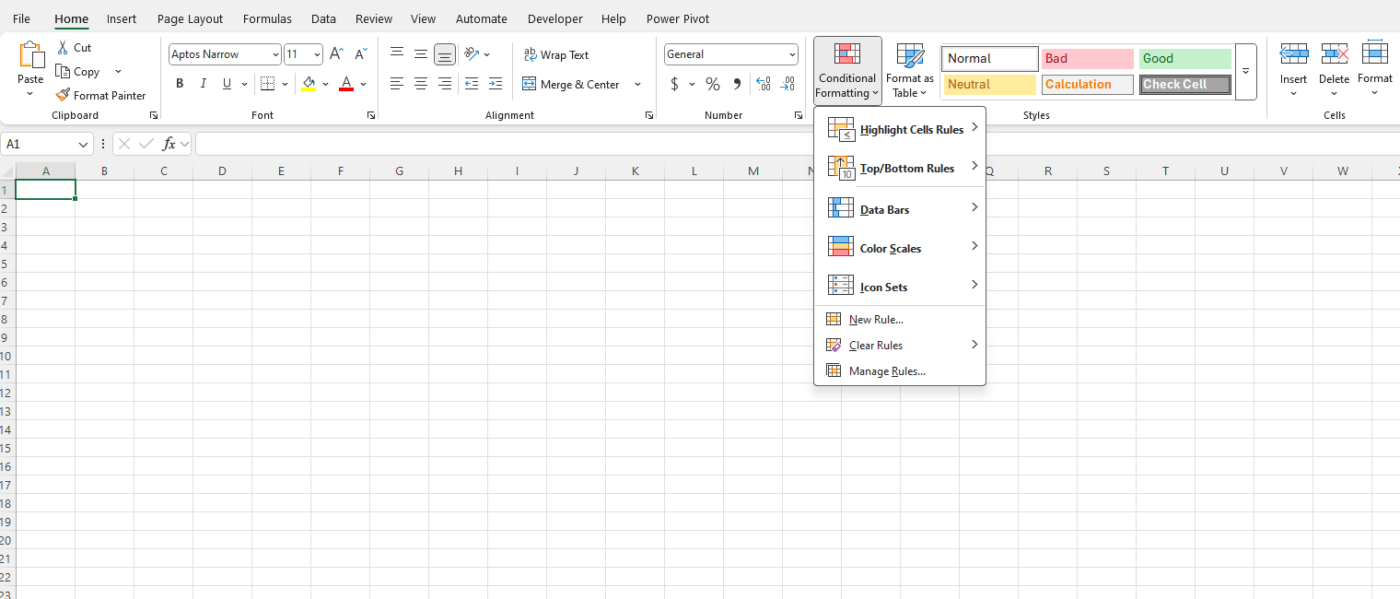
- Select your data range and go to Home > Conditional Formatting.
- Apply rules like “Top 10%” or “Values Greater Than X” to draw attention to key insights.
- Use color scales or data bars for visual impact.
8. Arrange Your Dashboard Layout
A well-designed layout is crucial for readability:
- Use a Clean Design: Avoid clutter and focus on key metrics.
- Group Related Items: Keep charts, slicers, and data tables organized by category.
- Add Labels: Clearly label charts, slicers, and sections for easy navigation.
- Use Gridlines and Shapes: Create visual boundaries with shapes or gridlines to separate sections.
9. Automate Updates
Dynamic dashboards should update automatically when new data is added:
- Use Excel Tables: Ensure charts and Pivot Tables are linked to dynamic ranges.
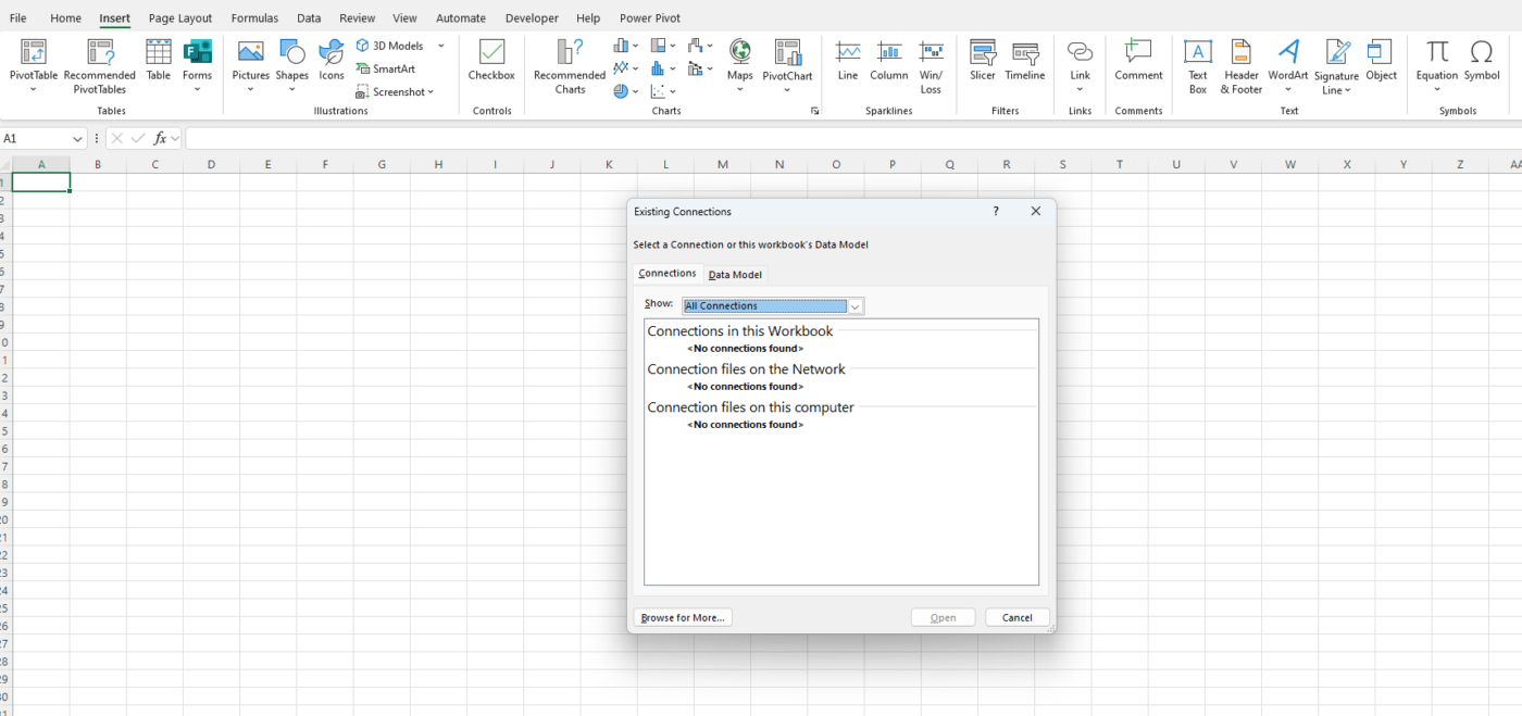
- Power Query: Import and clean data automatically. Go to Data > Get Data to set up Power Query.
- Refresh All: Use the Refresh All button in the Data tab to update all linked data sources.
10. Save and Share Your Dashboard
- Protect Your Work: Lock cells or sheets to prevent accidental changes. Go to Review > Protect Sheet/Workbook.
- Share as a File: Save as an Excel file or template to share with others.
- Export as PDF: For a static version, export your dashboard as a PDF.
- Publish Online: Use tools like OneDrive or SharePoint to share an interactive version online.
Get the cheapest Office Keys online and unlock premium productivity tools at unbeatable prices!

