Office Blog
Excel Tricks for Data Analysis and Visualization
Microsoft Excel remains one of the most versatile tools for data analysis and visualization. With its robust functionality, Excel enables users to clean, analyze, and present data effectively. Whether you’re a beginner or an experienced analyst, mastering Excel tricks can significantly enhance your productivity and make your data stories more compelling.
1. Efficient Data Cleaning
Remove Duplicates
Duplicate data can skew your analysis. Use Excel’s “Remove Duplicates” feature to clean your dataset:
- Highlight the data range.
- Go to Data > Remove Duplicates.
- Select the columns to check for duplicates and click OK.

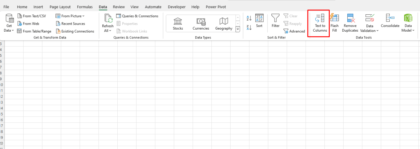
Text to Columns
If you have combined data (e.g., “Name, Age”), the “Text to Columns” feature helps split it:
- Select the column with combined data.
- Navigate to Data > Text to Columns.
- Choose “Delimited” or “Fixed Width,” then follow the wizard to split the data.

Trim and Clean Functions
- Use
=TRIM()to remove unwanted spaces. - Use
=CLEAN()to remove non-printable characters from your text.
2. Data Analysis with Formulas and Functions
VLOOKUP and XLOOKUP
=VLOOKUP(value, table, column, [range_lookup])quickly retrieves data from a specific column.=XLOOKUP()is a more advanced and flexible lookup function introduced in recent versions of Excel.
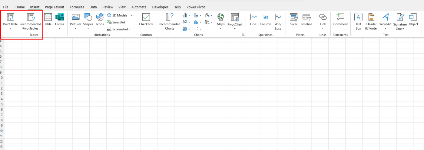
PivotTables
PivotTables summarize large datasets with minimal effort:
- Select your dataset and go to Insert > PivotTable.
- Drag and drop fields into Rows, Columns, and Values sections.
- Customize calculations using “Value Field Settings.”

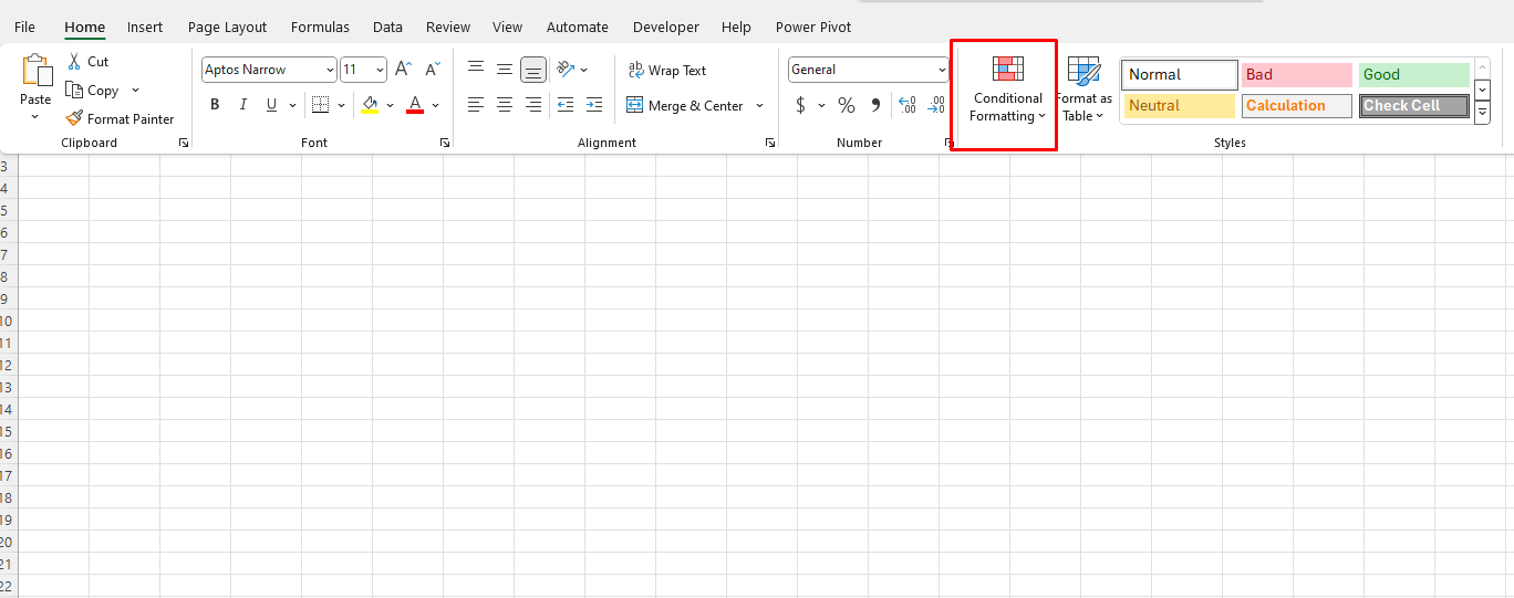
Conditional Formatting
Highlight critical data points using Conditional Formatting:
- Select the range.
- Go to Home > Conditional Formatting.
- Choose rules like “Greater Than,” “Top 10%,” or create custom formulas.

3. Visualization Techniques
Sparklines
Insert tiny, cell-based charts to visualize trends:
- Select a range for the Sparkline.
- Navigate to Insert > Sparklines.
- Choose Line, Column, or Win/Loss styles.
Combo Charts
Combine two chart types to highlight data relationships:
- Select your data range.
- Go to Insert > Insert Combo Chart.
- Choose a combination like Line and Column.
Slicers for Dynamic Dashboards
Slicers allow interactive filtering of PivotTables and PivotCharts:
- Click on a PivotTable or PivotChart.
- Go to Insert > Slicer.
- Select the fields you want to filter.
4. Advanced Tricks
Dynamic Named Ranges
Use dynamic named ranges to automatically adjust the data range:
- Go to Formulas > Name Manager > New.
- Define a name and use a formula like
=OFFSET(Sheet1!$A$1, 0, 0, COUNTA(Sheet1!$A:$A), 1).
Power Query
Power Query simplifies data extraction and transformation:
- Go to Data > Get & Transform Data > Get Data.
- Import from various sources and clean data using the Power Query Editor.
Data Validation Lists
Create drop-down lists to standardize input:
- Select the cell range.
- Go to Data > Data Validation.
- Set “Allow” to “List” and input the options.
5. Automation with Macros
For repetitive tasks, record macros:
- Navigate to View > Macros > Record Macro.
- Perform your actions and stop recording.
- Use the VBA editor for advanced scripting.
6. Integrating Excel with Other Tools
Power BI Integration
Export your Excel data to Power BI for advanced visualization:
- Save your Excel file to OneDrive or SharePoint.
- Open Power BI and connect to your Excel dataset.
Get genuine Office keys at unbeatable prices and unlock the full potential of your productivity tools without breaking the bank.

