Office Blog
Creating Interactive Excel Dashboards for Sales Teams
An interactive dashboard allows your sales team to visualize key metrics, monitor progress, and dive into detailed data without having to sift through long reports. In this blog, we will explore how to create interactive Excel dashboards that will streamline your sales processes and improve productivity.
1. Understand Your Sales Metrics
Before diving into the design and setup of your dashboard, it’s crucial to identify the key metrics your sales team needs to track. Some important metrics could include:
- Sales Revenue: Track the total sales and revenue generated over a period.
- Lead Conversion Rate: Measure how many leads have converted into sales.
- Sales by Region: Monitor regional sales performance to identify trends or areas needing attention.
- Top Products or Services: Highlight which products are driving the most revenue.
- Sales Goals vs. Actuals: Compare actual sales performance against set goals.
The first step in creating an interactive dashboard is defining what data is important for your team and what insights you hope to gather from it.
2. Set Up Your Data Sources
An Excel dashboard is only as good as the data it displays. To ensure your sales team can trust the data, it’s essential to pull from accurate, up-to-date sources. This could include importing data from your CRM system, internal databases, or third-party tools.
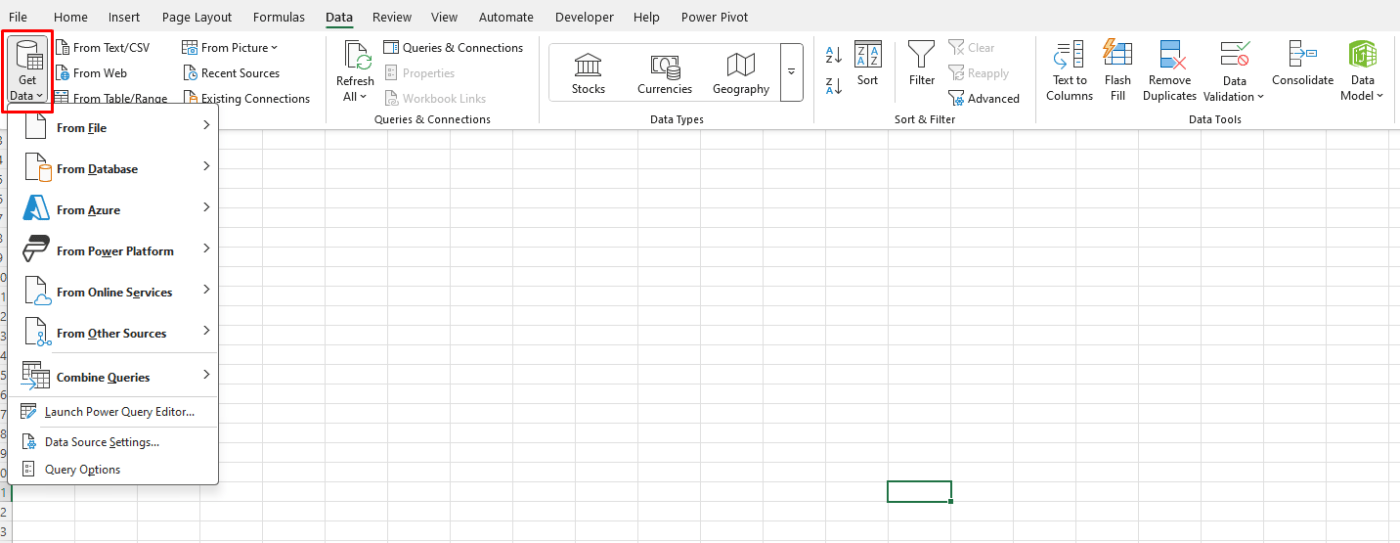
- Data Import: Use Excel’s “Get Data” feature to pull data directly from external sources like SQL databases or online reports.
- Organize Data: Keep data organized in structured tables to avoid confusion and allow for easy filtering and analysis.

By setting up a solid data foundation, you can ensure that your dashboard remains reliable and informative for your sales team.
3. Design Your Dashboard Layout
The design of your dashboard should prioritize clarity, simplicity, and ease of use. A clean, organized layout ensures that your sales team can quickly absorb key insights without feeling overwhelmed. Consider the following design tips:
- Top-Level Summary: Create a summary section at the top that gives an overview of key sales metrics at a glance, such as total revenue, goal completion, and lead conversion rate.
- Visualizations: Use charts, graphs, and tables to present data visually. Line charts are great for tracking trends over time, bar charts can help compare different categories, and pie charts can show proportions, like sales by region.
- KPI Highlights: Use color coding to highlight performance against targets. For example, green can indicate meeting or exceeding targets, while red signals areas that need improvement.
A well-organized layout not only makes the data easier to understand but also makes the dashboard more interactive and engaging for your sales team.
4. Add Interactive Elements with Filters
Excel allows you to add interactive features, making it easy for your sales team to drill down into the data and focus on specific segments. One of the most effective ways to add interactivity is by using slicers and drop-down menus.
- Slicers: Slicers are a visual way to filter data. For example, you can add a slicer to filter by region, product, or time period, allowing the user to instantly see how different segments are performing.
- Drop-Down Menus: For a cleaner interface, use drop-down menus that allow users to select specific data points to view. For example, a drop-down menu could let the sales team filter by sales rep, product category, or time frame.
By adding these interactive elements, your sales team will have more control over the dashboard and can customize their view to focus on what matters most.
5. Use Conditional Formatting for Visual Appeal
Conditional formatting in Excel allows you to apply color to cells based on their values, making it easier to spot trends and outliers at a glance. For example, you can:
- Highlight sales that are above or below target.
- Use color gradients to indicate performance levels, like red for low, yellow for medium, and green for high.
- Apply icons to visually represent performance, such as arrows to show positive or negative trends.
These small visual cues can significantly enhance the user experience and help your sales team quickly interpret the data.
6. Incorporate PivotTables for Flexible Analysis
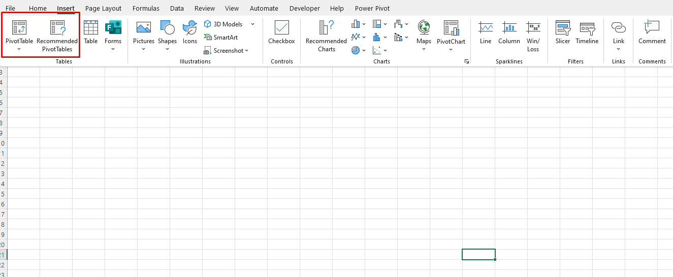
PivotTables are one of the most powerful features in Excel for summarizing large datasets. You can use PivotTables to create customizable views that allow users to analyze data from different angles without changing the underlying dataset.
For example, a sales manager could use a PivotTable to analyze performance by sales rep, region, or product category. Adding slicers to PivotTables enhances the interactivity, making it even easier for users to customize their analysis.

7. Keep Your Dashboard Updated
To ensure that the dashboard continues to be useful, it’s essential to keep the data updated regularly. This can be done by:
- Automating Data Refreshes: Set up automatic data refreshes if your data sources support it.
- Manual Updates: If your data needs to be entered manually, set a schedule to ensure that the dashboard is updated consistently, such as weekly or monthly.
An up-to-date dashboard will give your sales team the most accurate and actionable insights.
8. Share Your Dashboard
Once your interactive Excel dashboard is ready, sharing it with your sales team is the final step. You can share it through:
- Excel Files: Share the file via email or a shared network location.
- Online Platforms: Use cloud-based solutions like OneDrive or Google Drive to share and collaborate in real time.
Get cheap Office Keys today and secure your workspace with high-quality, budget-friendly solutions for all your office needs!

