Office Blog
Building Interactive Dashboards in Excel with Power BI
For anyone who relies on data to make decisions, interactive dashboards are essential tools. They transform raw numbers into visually compelling insights that are easy to explore and understand. Excel has long been a staple for data analysis, and with Power BI, you can supercharge its capabilities to create interactive dashboards that provide real-time insights.
In this post, we’ll walk through how to build an interactive dashboard in Excel using Power BI, so you can create dynamic visuals, leverage powerful data connections, and bring your data to life.
Why Use Power BI for Interactive Dashboards in Excel?
While Excel’s built-in tools offer a strong foundation for data manipulation and visualization, Power BI elevates these capabilities with its advanced analytics, data connectivity options, and interactive design features. Power BI integrates seamlessly with Excel, allowing you to:
- Connect to Multiple Data Sources: Pull data from various platforms, including databases, cloud services, and files.
- Automate Data Refreshes: Keep your dashboards updated automatically, so you’re always working with the latest information.
- Create Dynamic Visualizations: Access a variety of visual tools that go beyond standard Excel charts, including maps, gauges, and custom visuals.
- Add Interactivity: Use slicers, filters, and drill-throughs to let users explore the data and focus on details they need.
By using Power BI in conjunction with Excel, you’ll be able to build an interactive, visually impactful dashboard that provides a clearer picture of your data.
Step 1: Prepare Your Data in Excel
Data preparation is a crucial first step when building any dashboard. Well-organized, clean data in Excel will make it easier to create and manage visuals in Power BI.
- Organize Your Data: Structure your data in a table format with clear headers, consistent data types, and no blank rows or columns.
- Clean and Standardize: Remove duplicates, correct formatting inconsistencies, and fill any missing data. Consider using Excel’s Power Query to streamline and automate these tasks.
- Add Calculated Columns or Measures if Needed: Create any necessary calculated fields directly in Excel to enhance data analysis later.
This structured data will be easy to connect and manipulate in Power BI, enabling a smoother dashboard-building process.
Step 2: Connect Your Excel Data to Power BI
Once your data is ready, open Power BI Desktop and connect to your Excel file to start building your interactive dashboard.
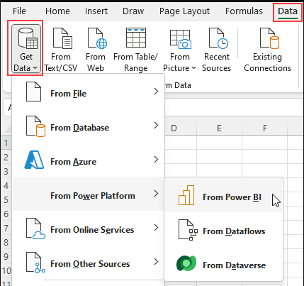
- Open Power BI and Select “Get Data”: In Power BI, choose “Excel” as your data source, then locate and import your Excel file.
- Load Your Data: Power BI will load your Excel data and display it in the “Fields” pane on the right. You can view each table and field, making it easy to organize and work with multiple tables.
- Define Data Relationships (if applicable): If you’re working with multiple tables, define relationships between them using common fields. Power BI’s Data Model feature allows you to set up these relationships, ensuring that data from different sources works seamlessly together.

Step 3: Build Your Visualizations
Now that your data is in Power BI, you can start building visualizations to transform numbers into actionable insights.
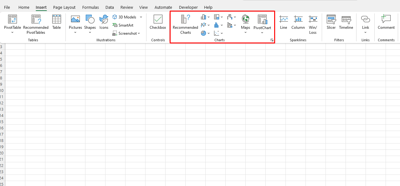
- Choose Visualization Types:
- Bar and Column Charts: Great for comparing categories or showing changes over time.
- Line Charts: Useful for tracking trends over periods.
- Pie and Donut Charts: Best for illustrating proportions within a dataset.
- Maps: Display geographic data by regions or cities.
- Cards and KPIs: Highlight single key metrics or progress toward a goal.

- Add Slicers and Filters:
- Slicers and filters allow users to interact with data directly. For example, if you’re presenting sales data, add a date slicer to let users filter results by month or quarter.
- Filters can also be applied to each visualization to control the data displayed based on user selection.
- Create Drill-Through Pages:
- Drill-throughs let viewers click on a specific data point to see more detailed information on a separate page. For example, clicking on a region in a sales chart could open a page with more details for that area.
- To set up drill-throughs, create a separate report page in Power BI and define the field that will trigger the drill-through.
- Design for Accessibility and Clarity:
- Use consistent colors, fonts, and labels for easy navigation. Power BI offers a variety of themes to ensure visual consistency.
- Arrange visual elements on the dashboard canvas so that important metrics stand out and related data is grouped together.
Step 4: Publish and Share Your Dashboard
Once your dashboard is complete, you can publish it to Power BI Service for sharing, so it’s accessible to your team or organization.
- Publish to Power BI Service:
- Save your report, then select “Publish” to send it to the Power BI Service.
- Once published, you can share the dashboard with others or embed it in an intranet or website.
- Embed in Excel:
- If you’d like to access the dashboard within Excel, use Power BI’s “Analyze in Excel” feature, which links your Power BI data to Excel. This allows you to leverage Power BI visuals and reports directly within an Excel workbook.
- Share a Live Link (optional):
- Generate a shareable link or embed code to share the dashboard externally if you need to present your insights to stakeholders outside your organization.
Get genuine Office keys at unbeatable prices—your most affordable solution for accessing essential Microsoft Office tools today!

