
Office Blog
Supercharge Excel Dashboards with PivotCharts

If you’re building Excel dashboards, you need a way to visualize data dynamically—and that’s where PivotCharts come in. PivotCharts turn PivotTable data into interactive, easy-to-read visuals that help you uncover trends, compare figures, and present insights effectively.
In this guide, we’ll cover what PivotCharts are, why they’re essential for dashboards, and how to create and customize them for maximum impact.
What is a PivotChart?
A PivotChart is an interactive chart linked to a PivotTable. Unlike regular charts, PivotCharts allow you to filter, sort, and drill down into data without modifying the original dataset.
Why Use PivotCharts?
✅ Automatic Updates – Changes in the PivotTable instantly reflect in the PivotChart.
✅ Easy Data Filtering – Built-in slicers and filters make data exploration seamless.
✅ Interactive Dashboards – Users can click through different categories and breakdowns.
✅ Simplifies Complex Data – Ideal for summarizing large datasets visually.
How to Create a PivotChart in Excel
Step 1: Insert a PivotTable
- Select your dataset (e.g., a sales report).
- Go to Insert → PivotTable.
- Choose New Worksheet and click OK.
Step 2: Create a PivotChart
- Click anywhere inside your PivotTable.
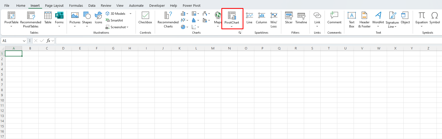
- Go to Insert → PivotChart.
- Choose a chart type (Column, Line, Pie, etc.) and click OK.
Step 3: Customize Your PivotChart
- Use Slicers: Insert slicers to filter data easily.
- Change Chart Type: Right-click the chart → “Change Chart Type.”
- Adjust Formatting: Add titles, adjust colors, and modify labels for clarity.
Best Practices for Using PivotCharts in Dashboards
1. Keep It Clean & Simple
- Avoid cluttering charts with too many data series.
- Use clear labels and colors to make insights obvious.
2. Use Slicers for Interactivity
- Add Slicers to let users filter data with a click.
- Go to Insert → Slicer → Select the field to filter by.
3. Link Multiple Charts to One Slicer
- Use the same slicer to control multiple PivotCharts for a synchronized dashboard experience.
4. Choose the Right Chart Type
- Column Charts – Best for comparisons.
- Line Charts – Great for trends over time.
- Pie Charts – Use for proportions, but avoid too many slices.
Get the cheapest Office keys today and enjoy instant access to Microsoft Office with genuine licenses at unbeatable prices!