Office Blog
Excel Tricks for Data Visualization Beyond Basic Charts
Excel is a powerful tool for more than just basic data storage and calculations; it also has incredible potential for data visualization. While most people are familiar with standard bar and pie charts, Excel offers many more options to creatively showcase and interpret data. Here are some tricks to take your Excel data visualization to the next level and make your data more engaging and insightful.
1. Conditional Formatting: Visualize Trends Instantly
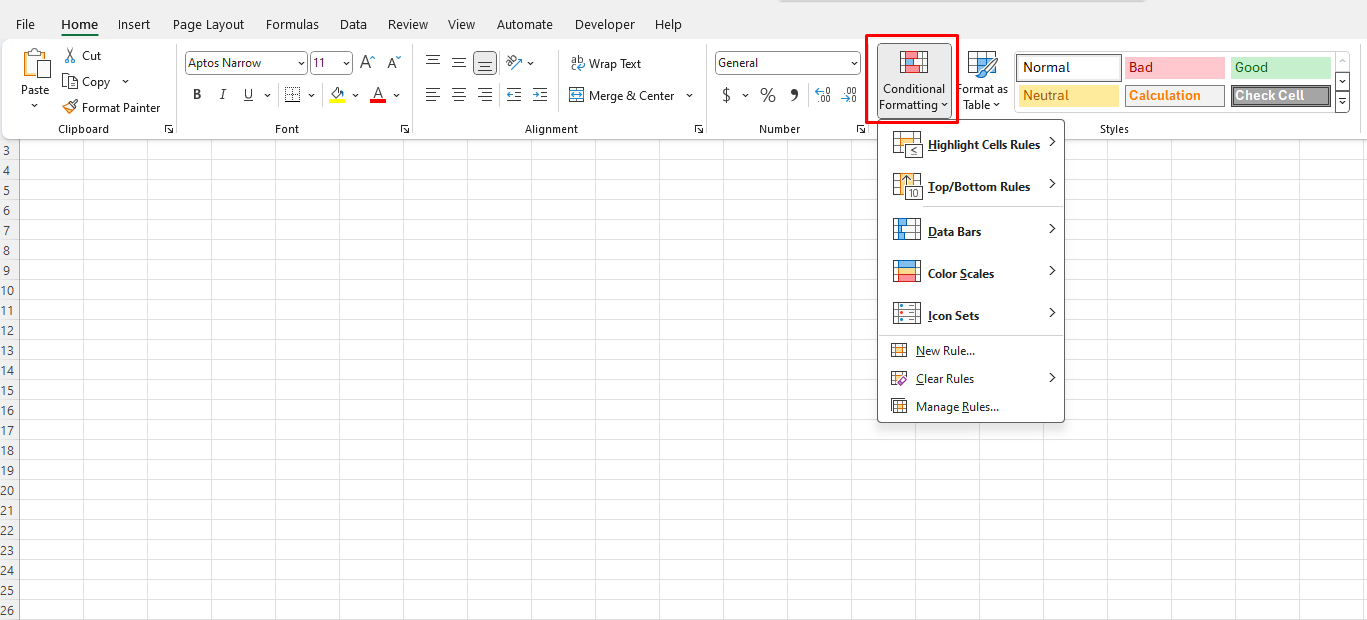
Conditional formatting allows you to apply color coding directly to cells, making patterns and trends in your data easy to see at a glance. You can use color scales, data bars, and icon sets to add visual context to numerical data.
Example: If you’re tracking sales performance, you can apply a green-to-red color scale to highlight high- and low-performing products.
- To use: Go to Home > Conditional Formatting and choose from options like Color Scales, Data Bars, or Icon Sets.

2. Sparklines: Mini Charts Within Cells
Sparklines are tiny charts that fit within a single cell to provide a quick visual summary of data trends. They’re perfect for comparing trends across rows of data without taking up too much space in your worksheet.
Example: Add sparklines next to monthly revenue data to show the upward or downward trend for each month.
- To use: Select the cells with data, then go to Insert > Sparklines. Choose between Line, Column, or Win/Loss sparklines, depending on your needs.
3. Dynamic Heat Maps: Make Patterns Pop
A heat map uses conditional formatting to apply colors based on the value of each cell, with higher values often in warmer colors like red or orange, and lower values in cooler colors like blue or green.
Example: In a large dataset of regional sales, use a heat map to see which regions are performing well at a glance.
- To use: Select your data, go to Home > Conditional Formatting > Color Scales and choose the color gradient that best represents your data.
4. Pivot Table Charts: Summarize and Visualize in One Step
Pivot Tables summarize large datasets, and you can enhance them with Pivot Charts for deeper insights. Pivot Charts update automatically as you modify your Pivot Table, giving you real-time visualization of any changes or filters you apply.
Example: Use a Pivot Table to show total sales by category, and add a Pivot Chart to view this data in a stacked column or pie chart format.
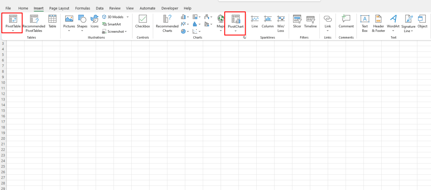
- To use: Insert a Pivot Table by going to Insert > Pivot Table. Once created, click Pivot Chart from the Pivot Table tools menu to add a visualization.

5. Custom Combination Charts: Tell a Multi-Layered Story
Combination charts allow you to overlay different chart types (e.g., column and line charts) in one view, providing a multi-dimensional look at your data. This is particularly useful for showing relationships between two sets of data with different scales.
Example: Use a column chart to show monthly revenue and a line chart on the same graph to show monthly profit margins.
- To use: Select your data, go to Insert > Combo Chart, and choose the best combination for your data series.
6. Gauge Charts: Track KPIs and Targets
While Excel doesn’t have a built-in gauge or speedometer chart, you can create one with a few tweaks. Gauge charts are helpful for displaying KPIs, targets, or any data where you’re tracking progress against a goal.
Example: Track customer satisfaction by using a gauge chart to show satisfaction ratings as a percentage.
- To create: Start with a Doughnut Chart and modify it to represent ranges (e.g., poor, fair, excellent) based on your data, then add an overlay to show the current performance level.
7. Map Charts: Geographical Data Made Easy
For data that includes location-based elements, Map Charts offer a clear and intuitive way to visualize data across different regions or countries. Excel’s Map Chart feature automatically formats data onto a world or regional map.
Example: Visualize sales data across various countries or states.
- To use: Format your data to include geographical information (e.g., country names or states). Then, go to Insert > Maps > Filled Map.
8. Waterfall Charts: Show Growth and Decline
Waterfall charts are effective for displaying how values change over time or between stages, with increases and decreases clearly visualized. This chart type is perfect for financial data or any dataset where you’re tracking cumulative changes.
Example: Show monthly revenue changes over a year with additions and subtractions visualized in a Waterfall chart.
- To use: Go to Insert > Waterfall Chart. Excel will automatically calculate the cumulative changes based on your data.
9. Box and Whisker Plots: Visualize Data Distribution
Box and Whisker plots, also known as box plots, display the distribution of data based on quartiles. They’re great for comparing distributions and identifying outliers in datasets.
Example: Use a Box and Whisker plot to show the distribution of employee performance scores across different departments.
- To use: Select your data, then go to Insert > Statistics Chart > Box and Whisker.
10. Histogram Charts: Analyze Frequency of Data
Histograms help you understand the frequency distribution of data, showing how often values occur within specific intervals. They’re helpful for data analysis, especially when you’re dealing with large datasets.
Example: Use a Histogram to display the frequency of various customer age groups in a survey.
- To use: Go to Insert > Statistics Chart > Histogram. Excel will calculate the frequency distribution based on your selected data.
Get genuine Office Keys at affordable prices and enhance your productivity with premium Microsoft Office features—without breaking the bank!

