
Excel Blog, Office Blog
What are the steps to create a Bubble Chart in Excel?

Bubble charts are excellent for visualizing relationships between three variables. They add a new dimension to your data representation compared to standard graphs. Follow this detailed guide to create a bubble chart in Excel.
Step 1: Open Your Excel Workbook
Start by opening Excel and loading the workbook containing the data you want to visualize.
- Command: Double-click the Excel icon and use
File > Opento select your workbook.
Step 2: Prepare Your Data
Make sure your data is organized properly. You need three columns for a bubble chart: one for the X-axis, one for the Y-axis, and one for the bubble size.
Step 3: Select Your Data
Highlight the data range you want to include in the bubble chart.
- Command: Click and drag to select the cells containing your data, or use
Ctrl + Shift + ↓/→to select contiguous ranges more quickly.
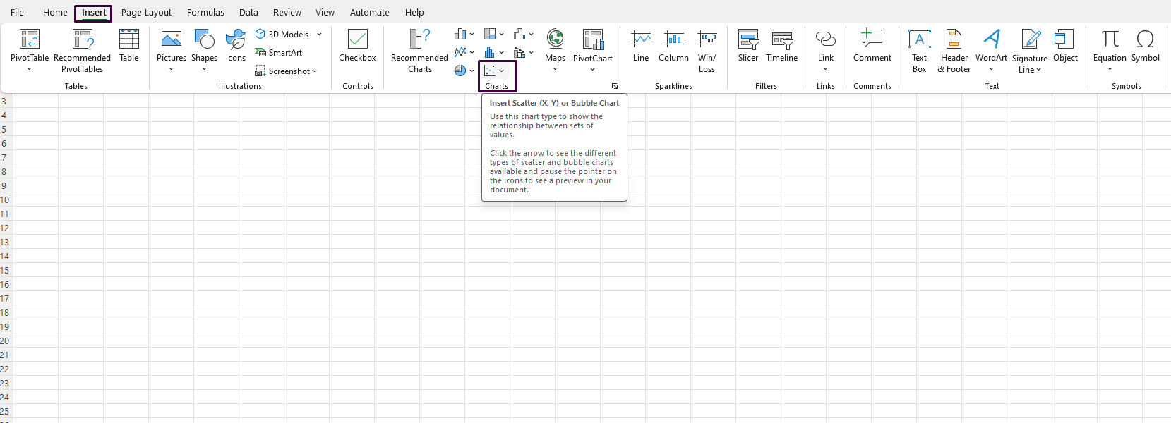
Step 4: Insert a Bubble Chart
Navigate to the insert menu to add a bubble chart to your worksheet.
- Command: Click the
Inserttab on the Ribbon. In theChartsgroup, click on theScatter Chartdropdown, then selectBubble.
Step 5: Adjust Chart Data Series
Ensure that Excel understands which columns correspond to the X values, Y values, and bubble sizes.
- Command: Click on the chart to activate Chart Tools. Then, go to
Chart Tools > Design > Select Data. In the dialog box, clickEditfor the bubble series and verify the ranges for the X values, Y values, and bubble sizes are correct.
Step 6: Customize the Chart
Make various customizations to improve the clarity and aesthetics of your chart.
- Command: While the chart is selected, use the
Chart Tools > DesignandChart Tools > Formattabs to customize colors, style, titles, and labels. For example, click onAdd Chart Elementsto include titles and axis labels.
Step 7: Add Data Labels (Optional)
Adding data labels can make your chart more informative.
- Command: Click on the chart, then go to
Chart Tools > Design > Add Chart Element > Data Labelsand choose a preferred label position.
Step 8: Resize and Move the Chart
Adjust the size and position of the chart as needed.
- Command: Click and drag the edges of the chart to resize it. To move it, click and drag from the center of the chart to a new location on your worksheet.
Step 9: Save Your Workbook
Once your bubble chart looks perfect, save the workbook to preserve your changes.
- Command: Go to
File > Saveor pressCtrl + Sto save.
Unlock the full potential of your productivity with our genuine Office keys, available for immediate purchase at unbeatable prices.